MATT FAJKUS ARCHITECTURE
Austin-based firm uses sustainable strategies to empower the client and drive design
AUTOCAD CUSTOMER SUCCESS STORY
Share this story
Finding true focus for successful design
For Matt Fajkus Architecture, preconceived designs and adherence to one aesthetic simply aren’t options. The firm is driven by the philosophy that the site itself, the client, the goals and sustainability deliver the optimum results – whether it’s residential or commercial. Two housing projects demonstrate its philosophy, all with the help of AutoCAD to meet the challenges of planning regulations, construction, and “optioneering.”
Achieving design goals with inherent challenges
Based in Austin, Texas, Matt Fajkus Architecture (MF Architecture) is committed to making a positive impact on both a global and local level. According to US Census Bureau estimates, the Austin metropolitan area adds more than 151 people to the population each day. The housing crunch is severe and MF Architecture strives to discover and build on sites that others had passed on due to difficulty or constraints. At the same time, sustainable design principles – including energy-efficient strategies, passive daylighting and intelligent material choices – are paramount.
“We let the site inform our design,” says Sarah Johnson, principal architect, MF Architecture. “How does the building fit well on the site in terms of solar orientation or breezes? How can we build around existing trees? We want to find ways to cleverly work around these things: keep the tree, find the square footage for the building and really create something that is very special, unique and sustainable that we wouldn’t have otherwise designed without those site circumstances.”
And, with AutoCAD, the firm can achieve that.
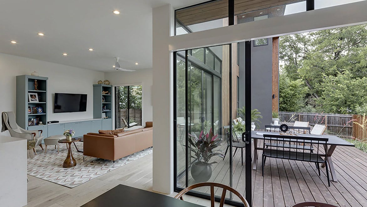
Sitting room and dining room in the Add/Subtract House. Courtesy Charles Davis Smith.
Narrow plot? That is no problem.
The core principles of the practice are perfectly on display with the Add/Subtract House in Austin. MF Architecture was presented with a multitude of challenges for the new construction of a home: strict planning regulations on the plot with limitations on building to prevent flooding, a dense neighbourhood, budget constraints, and the client’s desire for a progressive look.
“It was quite clear that due to the geometry of the plot, we weren’t going to be left with much of a back garden,” says Matt Fajkus, founder and principal, MF Architecture. “We realised that it needed to be one long, linear house with a two-car garage (a requirement from the client) in the very front of the house and needed to have a focus on bringing in light.”
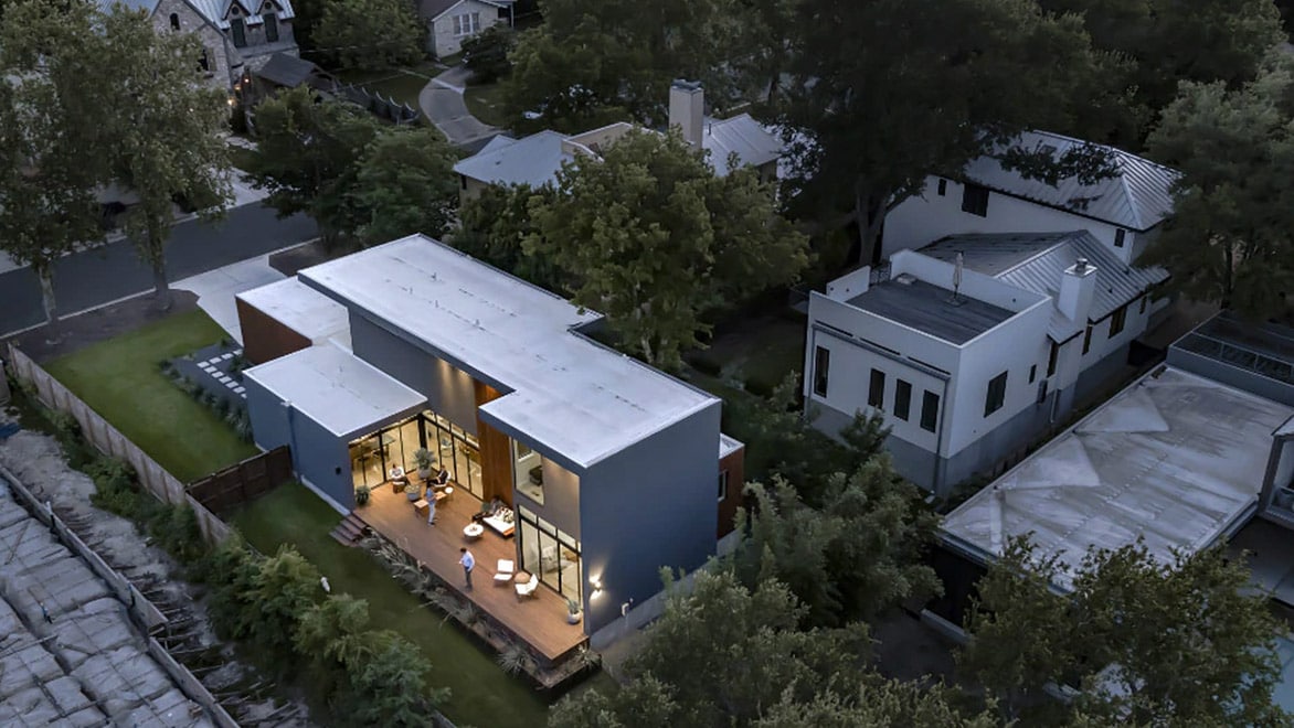
Exterior of the Add/Subtract House. Courtesy of Charles Davis Smith.
Speed in the actual design and “optioneering” with the evaluation of many options were huge benefits to moving the project along. Keyboard shortcuts in AutoCAD helped the team immensely in achieving the design quickly and efficiently. “We want our clients to be involved in the process and be a part of the team in developing what the building is,” Johnson says. “That comes with giving them options and letting them have input. And that would be very difficult to do if we were required to do this by hand. Having tools like AutoCAD to be able to quickly mock up multiple variations of one drawing is very helpful.”
The design itself became an act of addition and subtraction – hence the Add/Subtract House name. “We pushed and pulled certain volumes out,” Fajkus says. “The dining room space was pulled out, which creates the definition of the outdoors. And then we pushed in where the staircase is to bring light to that portion. There were a few moves that were just adding and subtracting to the overall volume or mass of the house in different areas.” In addition, each room of the house receives natural light from at least two sides, dramatically reducing the need for electric light.
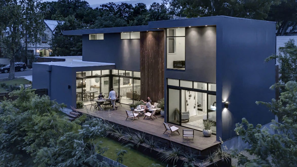
Back garden of the Add/Subtract House. Courtesy of Charles Davis Smith.
Trianglular plot? Also not a problem.
For the Interlock House, MF Architecture faced a different challenge: add square footage to an outdated 1950s home on a corner, triangular plot. Of course, the design team wanted to make something exciting and functional for the owner as well.
“We really needed to respond to the site and what it could offer, while making sure that we were thinking about how to capture direct and indirect views, direct light and indirect light,” Fajkus says. “It was literally a chance to breathe some new life into this structure that wasn’t working for not only the owners but also the neighborhood. It was quite drastically undersized relative to all the comparable houses and out of character with all the rest of the homes.”
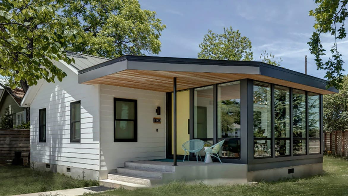
Exterior of the Interlock House. Courtesy of Charles Davis Smith.
David Birt was the MF Architecture principal-in-charge of the Interlock House, and even with a special variance and permission from the Board of Adjustment at City Hall, the firm could add only 500 square feet to the original 800-square-foot dwelling. That meant quite a bit of optioneering to find the right function, experience and circulation. And, in terms of sustainability, the firm added carefully placed skylights, clerestory windows and full-height glass doors and windows adjacent to eaves and overhangs for protection from excessive sunlight and solar gain. Furthermore, the colours and tones of material choices, made in conjunction with Katie Marye of Studio Tupelo, were intentionally bright to bounce direct and indirect daylight around the spaces.
“The functional flow was designed such that you actually enter through an easement next to the property and then walk into the dining room that doubles as a vestibule and foyer,” Fajkus says. “When you come into the sitting room and walk behind the couch, it serves as a functional space where the barn door is and the little pocket niche for an office. This leads to a corridor that is small but very naturally lit. The aim was make a series of minimal-yet-clever design moves to get the most bang for the owner’s buck, but within a very constrained lot where we absolutely could not have more than 1,300 square feet due to city planning regulations.
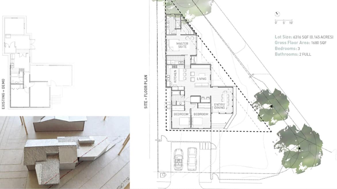
Design for the Interlock House. Courtesy of Matt Fajkus Architecture.
“We looked at a two-storey option at one point, but the staircase alone consumed so much square footage,” he continues. “So we started looking at the other options. In sketch form, physical-model form and in AutoCAD, we could craft those options, discuss the pros and cons of each with the owner and the contractors, and essentially arrive at decisions that worked for everybody.”
Tackling planning regulations and construction challenges with the help of AutoCAD
Designing with AutoCAD, the team relied on precision and accuracy to meet the demands of planning regulations and the actual construction of both projects. Principal Architect David Birt directs the quality-control sector of the practice, among other roles and he routinely considers best practices for analogue and digital drawing production, all in the service of good design.
“When we’re calculating the area of the site, it’s helpful to be able to polyline and be able to store the polyline on a layer that’s turned off,” Johnson says. “Often, we’re building right up to the square foot. So even during construction, we can pull out the polyline and show the contractor that you can’t do something like add an extra paved walkway because we’ve allocated for everything and have hit our limit.”
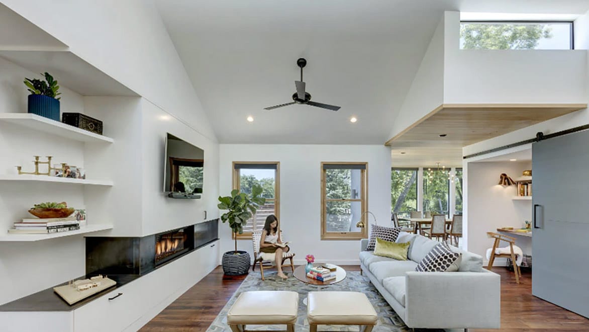
Sitting room and functional space in the Interlock House. Courtesy of Charles Davis Smith.
“In terms of being able to respond to reviewer comments and update drawings quite quickly, it’s critical to have a set of clean drawings where everything is broken out into layers so you can then isolate and change certain things,” Fajkus adds. “That certainly is one aspect of using AutoCAD within the City of Austin, knowing that you usually have to do some work to modify the design of your drawings based on comments from the city.
“Even if you are as familiar as you could possibly be with the regulations, they still change quite frequently, and sometimes unannounced,” he continues. “Change is a necessary part of any drawing set. And not only in the design process, but even in the permitting process to get it through approvals. Being able to have software like AutoCAD that allows for quick modification through layer management is especially important.”
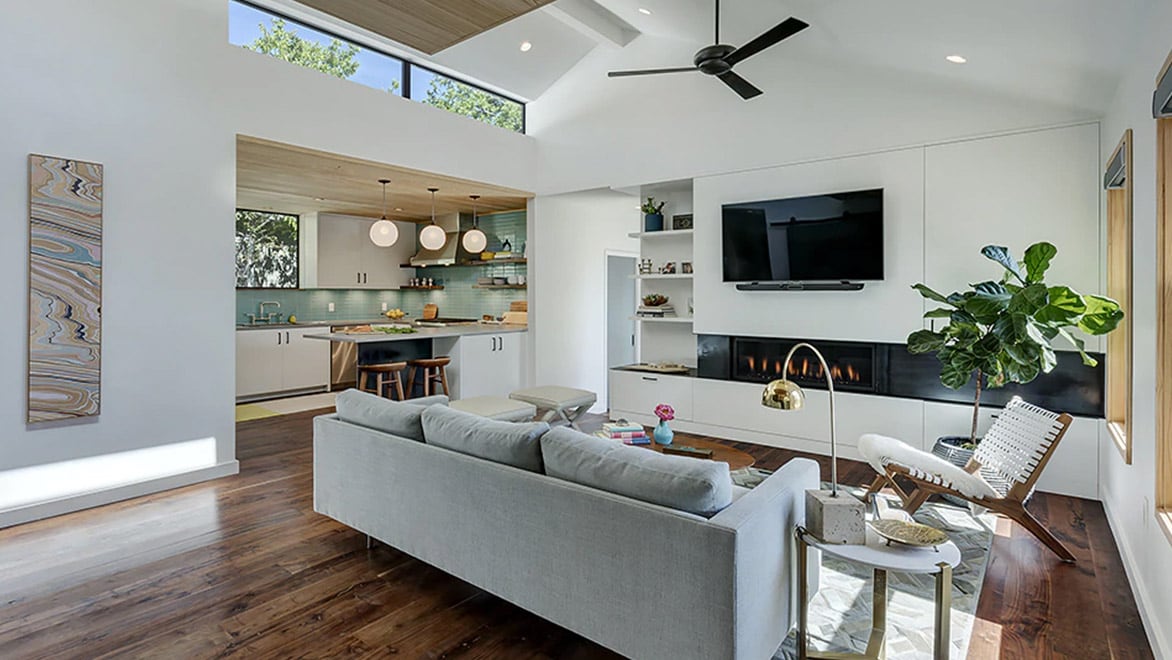
Sitting room and functional space in the Interlock House. Courtesy of Charles Davis Smith.
Discover the power of AutoCAD
Speed up and streamline your workflow with a subscription to AutoCAD including specialised toolsets.